
Amavita Supplements
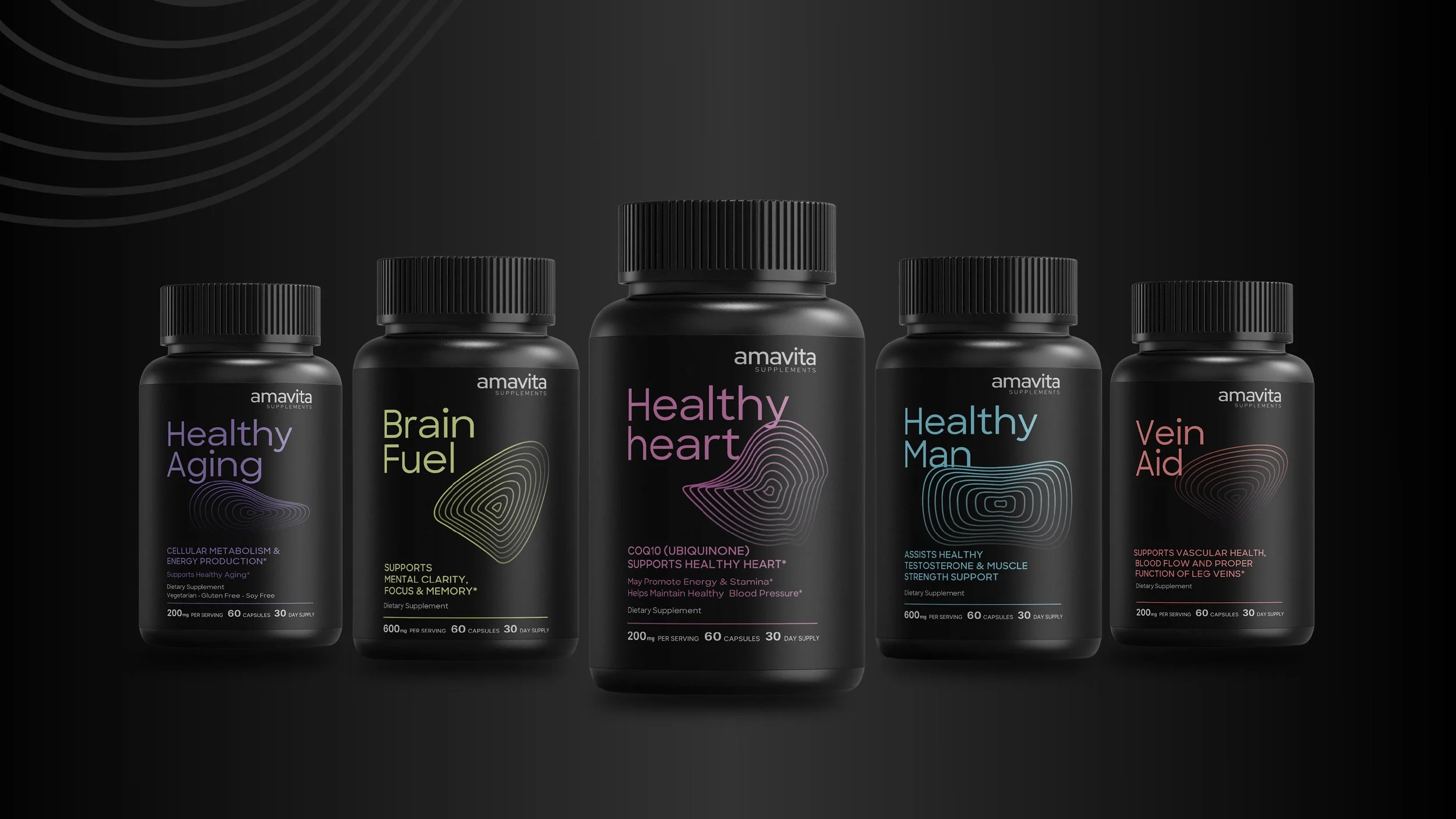
Amavita, a Miami-based health clinic, wanted to launch their own supplement line with minimal, typographic packaging. While this approach would have been clean, it risked getting lost in a crowded market.
I proposed elevating the design with a conceptual graphic system based on biometric waveforms—reinterpreted as circular radiations that ripple outward like vital signs. Each supplement received its own unique waveform pattern and color, creating visual distinction while suggesting the body's response to each formula: steady for "Healthy Aging," sharp for "Brain Fuel," rhythmic for "Healthy Heart," dynamic for "Healthy Man," and flowing for "Vein Aid."

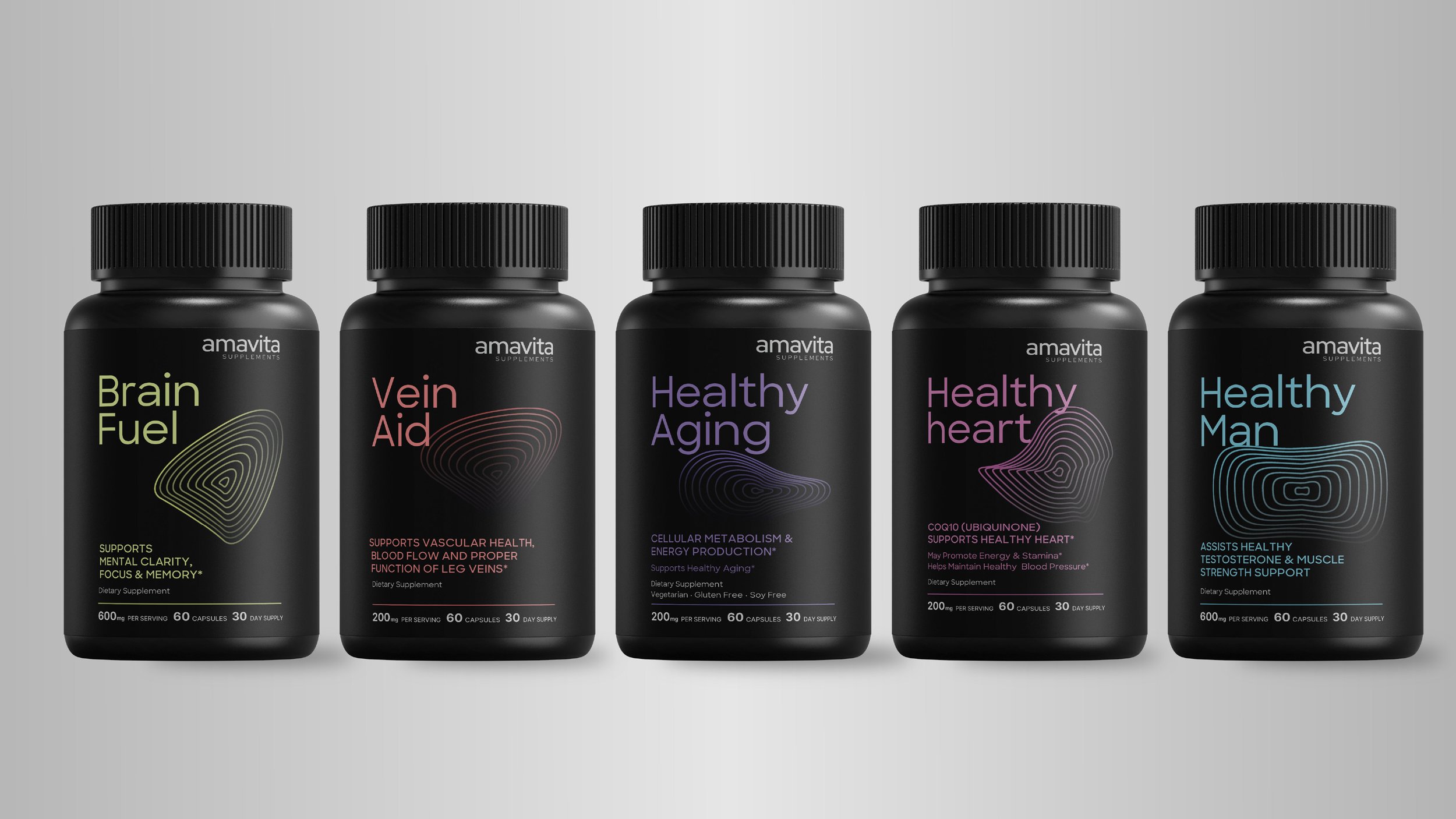
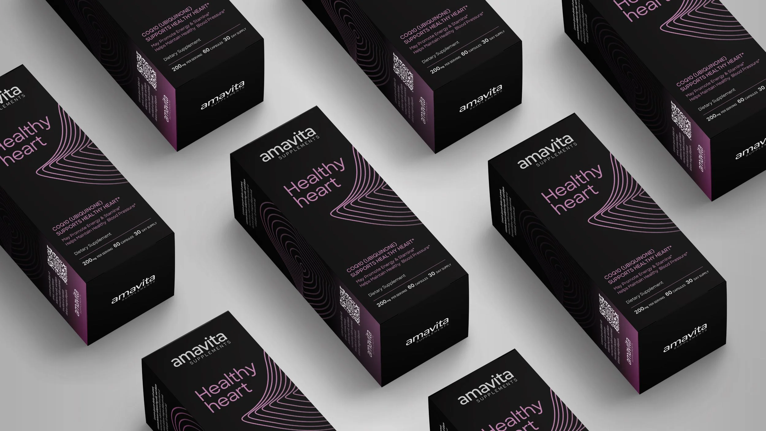
The packaging maintains Amavita's desired minimalism—clean typography, clear information—but the waveform graphics give each product personality and shelf presence. The result is a supplement line that feels both sophisticated and approachable.
